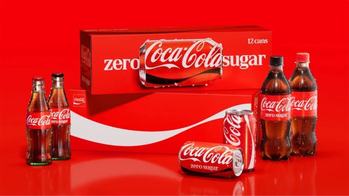
How do you redesign one of the most recognizable logos on planet Earth without upsetting billions of loyal drinkers? If you are corporate leadership at Coca-Cola, the answer is simple: you pay a world-renowned design agency to make your brand look… exactly like itself. The Coca-Cola Company officially unveiled a sweeping new global visual identity. Dubbed "One Bold Visual System," the massive refresh is rolling out across more than 200 international markets, spanning packaging, retail environments, digital apps, and vending equipment.
The creative brief given to lead branding agency Jones Knowles Ritchie (JKR) was surprisingly straightforward: "Make Coca-Cola more Coca-Cola." Instead of throwing out a century of heritage, the rebrand doubles down on the company’s "holy trinity" of visual assets: the classic Spencerian script, the vibrant red-and-white color palette, the curved Dynamic Ribbon, and the framed Arden Square. The rollout also introduces a brand-new internal "Design Intelligence" AI platform and an immersive digital Brand Center to help global teams enforce strict visual consistency.
However, as soon as the high-gloss corporate mockups hit social media, the internet did what it does best: it relentlessly roasted the beverage titan.
The Marlboro Comparison
While Coca-Cola aimed for timeless, heritage-driven elegance, social media users immediately spotted an awkward visual parallel in the campaign's typography.
To give marketing materials a more editorial, human feel, the rebrand heavily features "Better With," a custom serif typeface created for the brand by Brody Associates. But when rendered in bold red and cream-white across advertising billboards and packaging, internet sleuths on X (formerly Twitter), Threads, and TikTok noticed an unmistakable resemblance to Marlboro cigarettes.
"Love that they just leaned into the fact that soda is the new cigarettes by just straight up doing the Marlboro font," joked one viral post on X.
"Coca-Cola switching to a Marlboro font lookalike is the most self-aware thing a sugar company has ever done," added another widely shared comment.
Design critics noted that pairing a retro, heavy-bracketed serif font with Coke’s signature red-and-white color block created a hilarious visual illusion that looks suspiciously like a pack of 1980s smokes—a less-than-ideal brand association as governments worldwide clamp down on sugary drinks.
Flavor Confusion & The Zero Sugar Pivot
Beyond the cigarette jokes, grocery shoppers and everyday consumers are raising practical concerns about how the unified look will perform on actual supermarket shelves. By making every single can, bottle, and box share the same hyper-consistent "One Bold System" aesthetic, consumers worry it will become significantly harder to tell different flavors and diet variations apart at a quick glance:
- The Obfuscation Critique: Shoppers are complaining that stripping away distinct background colors and flavor cues makes grabbing a cherry, vanilla, or caffeine-free Coke in a crowded cooler feel like a guessing game.
- The Zero Sugar Tweak: To combat this issue, Coca-Cola Zero Sugar is receiving a slightly tweaked sub-identity. It now features enlarged "Zero Sugar" typography, a prominent black Dynamic Ribbon across cans, and a solid black bottle cap on PET plastic bottles to help it stand out from the flagship original taste.
Corporate Jargon vs. Consumer Reality
The rebrand also triggered plenty of laughter from branding veterans and marketing commentators, who took aim at the ultra-serious corporate language used to justify subtle design tweaks. In official press statements, Arnab Roy, President of Coca-Cola Global Category, explained:
"This refresh is about being clearer and more consistent in how we show up, wherever people experience our brand. By building on the things people already know and love, we're creating a stronger foundation for growth while staying unmistakably Coca-Cola."
Meanwhile, Rapha Abreu, Global Vice President of Design, declared that the company can now deliver "one recognizable brand experience to consumers."
To the average consumer who just wants an ice-cold soda on a hot July afternoon, spending millions of dollars to achieve a look that most people can barely distinguish from the 2021 packaging feels like the ultimate exercise in corporate navel-gazing. Whether the Marlboro typography meme dies down or lingers as a permanent design trivia fact, one thing is certain: Coca-Cola got the entire internet talking about its cans again.
;Resize,width=767;)
